* UPDATED 2nd SEPTEMBER 2013 *
Whenever I have needed a map in a presentation, I have always slipped in a cheeky screenshot from Google and prayed that the copyright police won’t burst into the door and arrest me (talks are stressful enough). However, I was determined to change this, and after extensive trawling of the web, I’ve put together a quick template to make a simple large scale map for talks, presentations and posters using GIS shape files and ggplot2.
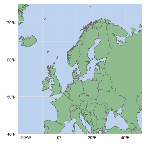
Here is the finished object (full code at the end of this page):
I started by downloading this excellent world map template from thematicmapping, and loading it into R using the maptools package:
library(maptools)gpclibPermit()## [1] TRUEworldmap <- readShapeSpatial("world_borders.shp")
*** NB: You will require the library gpclib to read in the shapefile – if gpclibPermit() returns FALSE, then try installing gpclib again. As of Sep 2013, gpclib was not working in R v3.0.1. Argh. ***
The fortify function in ggplot2 will convert this to a data frame:
library(ggplot2) worldmap <- fortify(worldmap)## Using CAT to define regions.
Let’s have a quick look:
head(worldmap)## long lat order hole piece group id ## 1 -69.88 12.41 1 FALSE 1 1.1 1 ## 2 -69.95 12.44 2 FALSE 1 1.1 1 ## 3 -70.06 12.53 3 FALSE 1 1.1 1 ## 4 -70.06 12.54 4 FALSE 1 1.1 1 ## 5 -70.06 12.54 5 FALSE 1 1.1 1 ## 6 -70.06 12.62 6 FALSE 1 1.1 1
Essentially, this data frame is a list of paths/polygons (each one is part of a unique ‘group’) that we can plot using geom_path and geom_polygon. There are more than 400,000 points in this map which makes plotting quite slow, so I created a smaller data frame, worldmap2, to create rough maps for initial tweaking and formatting.
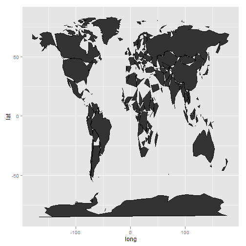
worldmap2 <- worldmap[seq(1, nrow(worldmap), 200), ] A quick plot using geom_polygon, creating groups based on the variable ‘group’:
ggplot(worldmap2, aes(x = long, y = lat, group = group)) +
  geom_polygon()
The same with geom_path:
ggplot(worldmap2, aes(x = long, y = lat, group = group)) +
  geom_path()
And using both (Put geom_path second in order to plot the borders):
ggplot(worldmap2, aes(x = long, y = lat, group = group)) +
  geom_polygon() +
  geom_path()
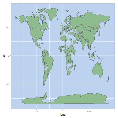
Changing the colour of the polygons and path is straightforward:
ggplot(worldmap2, aes(x = long, y = lat, group = group)) +
  geom_polygon(fill = "darkseagreen") +
  geom_path(colour = "grey40")
Creating a blue blackground required delving further into the mysterious world of theme(). I also changed the colour of the plot border and major grid lines to reduce the contrast slightly:
ggplot(worldmap2, aes(x = long, y = lat, group = group)) +
  geom_polygon(fill = "darkseagreen") +
  geom_path(colour = "grey40") +
  theme(panel.background = element_rect(fill = "lightsteelblue2", colour = "grey"),
       panel.grid.major = element_line(colour = "grey90"))
I wanted a map of Northern Europe, so I defined my latitude and longitude limits, and used coord_cartesian to zoom in onto the graph. With this mapfile, you can change latlimits and loglimits to your specific region of interest:
latlimits <- c(40, 75) longlimits <- c(-25, 50) ggplot(worldmap2, aes(x = long, y = lat, group = group)) + geom_polygon(fill = "darkseagreen") + geom_path(colour = "grey40") +theme(panel.background = element_rect(fill = "lightsteelblue2", colour = "grey"), panel.grid.major = element_line(colour = "grey90")) +coord_cartesian(xlim = longlimits, ylim = latlimits)
The scales are still more suited to the full graph, so now we can define our scale to be more relevant.
ggplot(worldmap2, aes(x = long, y = lat, group = group)) + geom_polygon(fill = "darkseagreen") + geom_path(colour = "grey40") +theme(panel.background = element_rect(fill = "lightsteelblue2", colour = "grey"), panel.grid.major = element_line(colour = "grey90"))+ scale_y_continuous(breaks = seq(40, 70, 10)) + scale_x_continuous(breaks = seq(-20, 40, 20))+coord_cartesian(xlim = longlimits, ylim = latlimits)
Now time to customise the graph a little more: removing the axis titles, relabelling the axes, removing the axis ticks, and making the text larger. Then we can use the original worldmap data frame to produce the final product:
# Final code:

library(maptools)
require(gpclib)
gpclibPermit()
worldmap <- readShapeSpatial("world_borders.shp")

library(ggplot2)
worldmap <- fortify(worldmap)

latlimits <- c(40, 75)
longlimits <- c(-25, 50)

ggplot(worldmap, aes(x = long, y = lat, group = group)) +
  geom_polygon(fill = "darkseagreen") +
  geom_path(colour = "grey40") +
  theme(panel.background = element_rect(fill = "lightsteelblue2", colour = "grey"),
       panel.grid.major = element_line(colour = "grey90"),
       panel.grid.minor = element_blank(),
       axis.ticks = element_blank(),
       axis.text.x = element_text (size = 14, vjust = 0),
       axis.text.y = element_text (size = 14, hjust = 1.3)) +
  coord_cartesian(xlim = longlimits, ylim = latlimits) +
  scale_y_continuous(breaks=seq(40,70,10), labels = c("40ºN", "50ºN", "60ºN", "70ºN")) +
  scale_x_continuous(breaks=seq(-20,40,20), labels = c("20ºW", "0º" ,"20ºE", "40ºE")) +
  labs(y="",x="")


Thank you very much for this guide! It was very useful and I’ve learned a lot! ggplot2 is a powerful graphic package and with thematic map (and not google) possibilities are endless! Thx again! 😉
Dear Susan,
Thanks for the post, it is very useful for a ggplot-beginner like myself. For some reason though, R indicates that it cannot find the “group” object when running the code.
Hi there Stephan,
This code is a little old now – since then, there have been fairly significant syntax changes in ggplot2, and so some parts of it may not work as before. I will take a look at the code and get back to you over the next day or two. Watch this space!
Hi Stefan, sorry that his took a while to respond. The group object does seem to be a new problem associated with code changes in ggplot2. Are you adding additional data layers to the plot? I encountered the same problem in that case – I solved it by adding a dummy group variable to the data.
Great tutorial! It is going to be very useful for my research too.
Reblogged this on Susan E Johnston and commented:
Updated version of previous post!
First, thanks for this guide. I would like to know if its possible to have only the outline of the world map, i.e., without the internal divisions between connected polygons. Thanks in advance.
Dear Susan,
I thank you very much for this clear and concise guide. I have created beautiful map based on your codes. Keep up the good work. Thanks
Hi thanks foor sharing this